
Establishing a destination
Rampen is a new destination in Bodø that offers spectacular experiences in stunning nature.
What we did
- Positioning
- Brand platform
- Naming
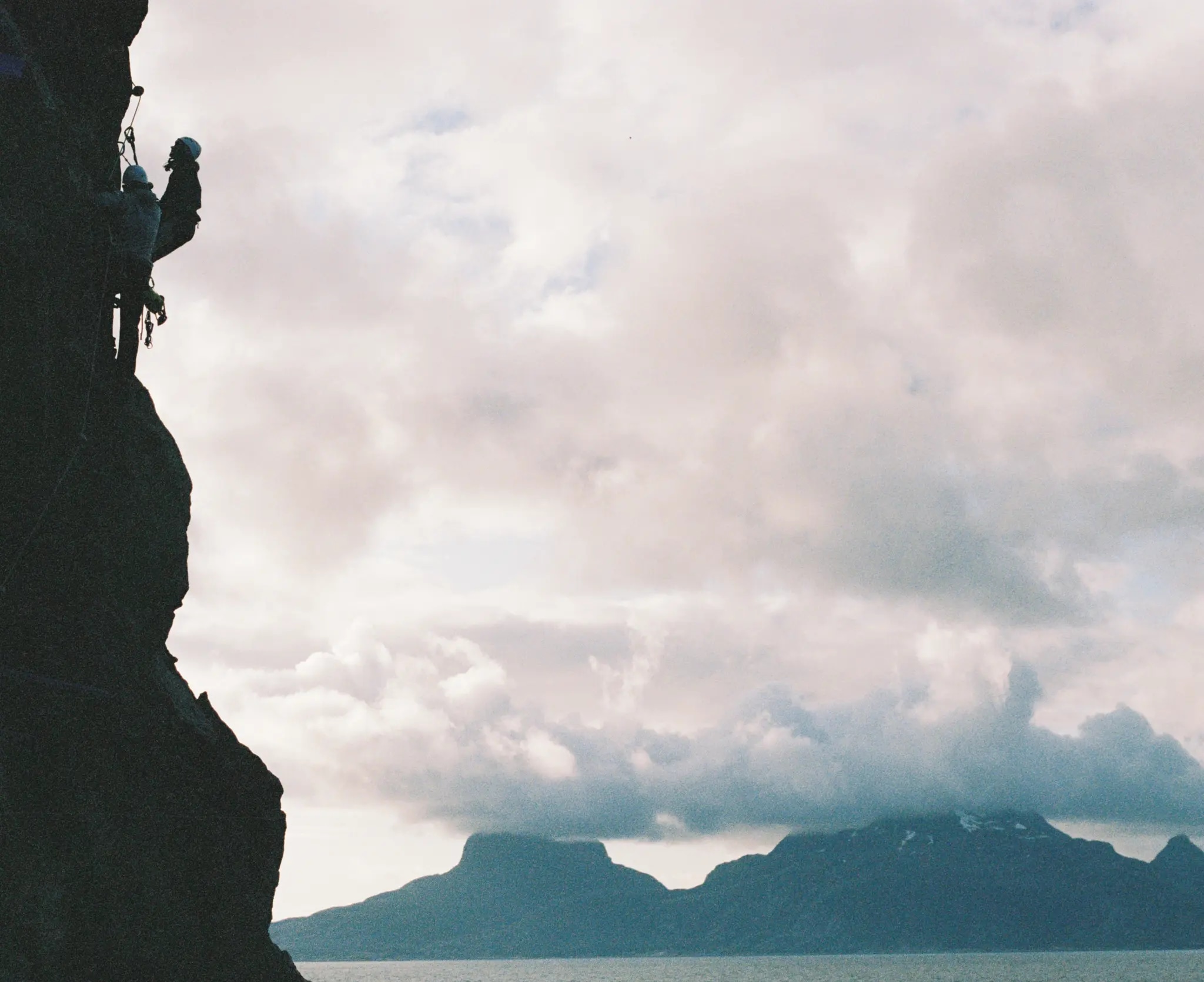
How do you get people to book a via ferrata right above the North Sea?
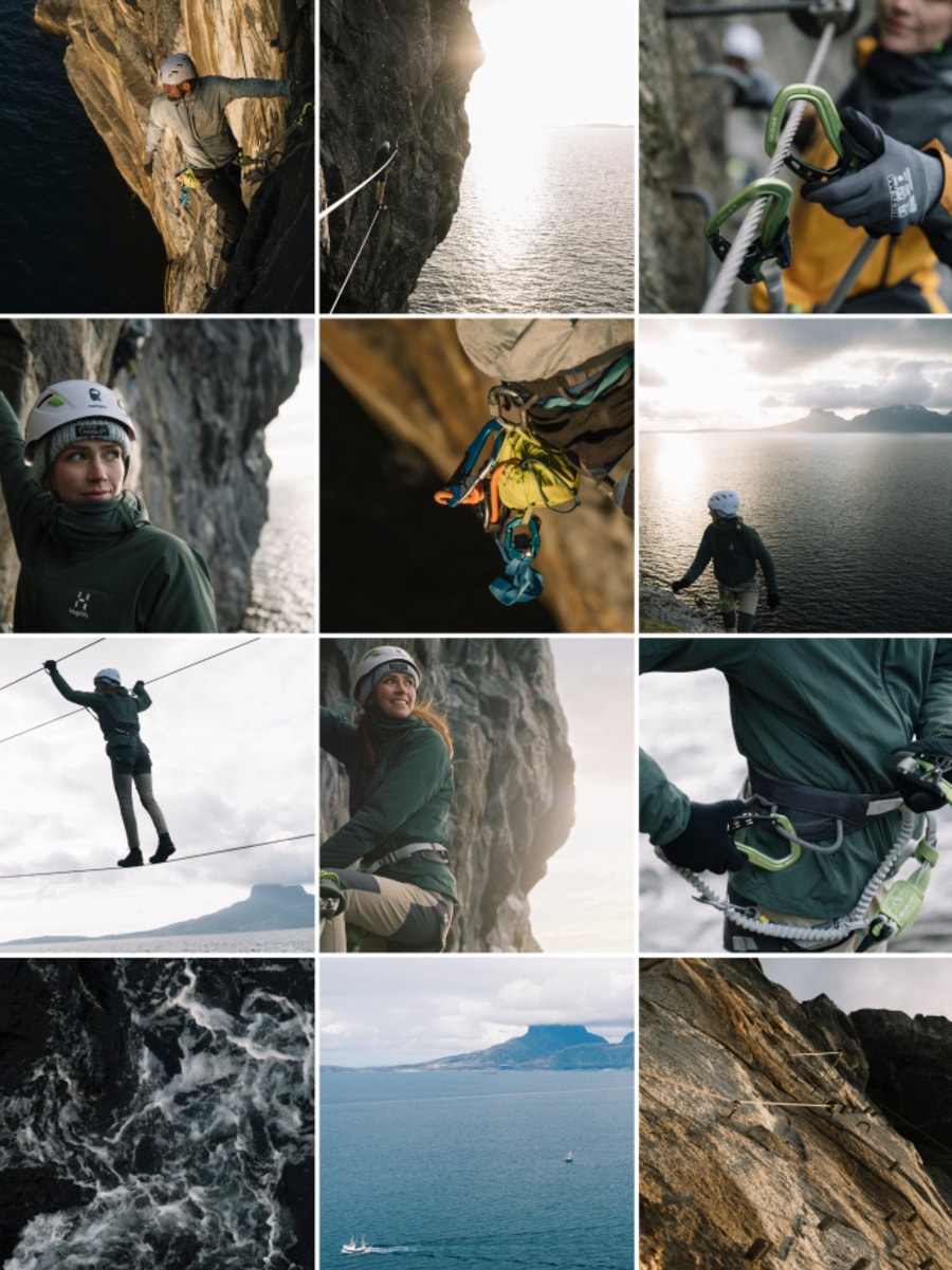
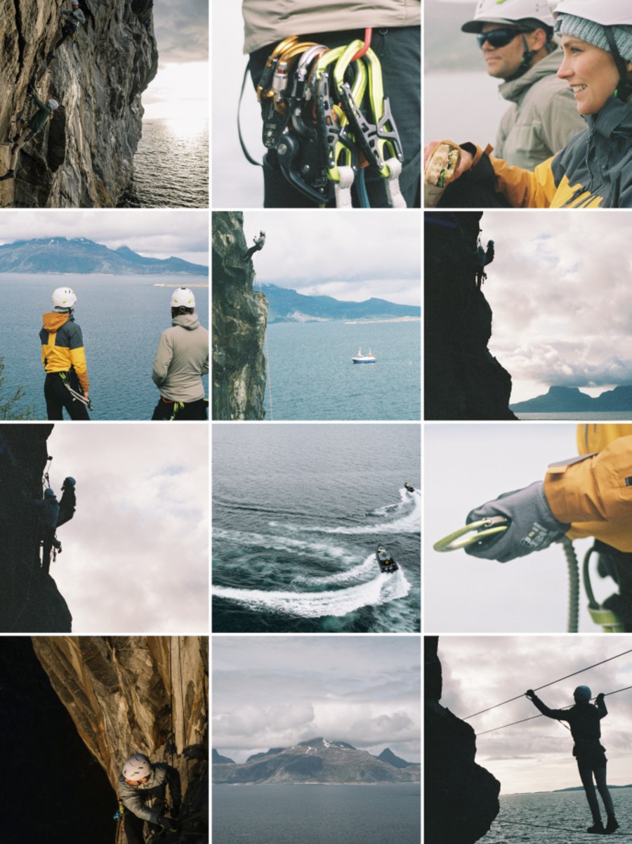
With tight art direction and a focused brand strategy we managed to give people online a true wow feeling of this unique experience without spilling the beans.
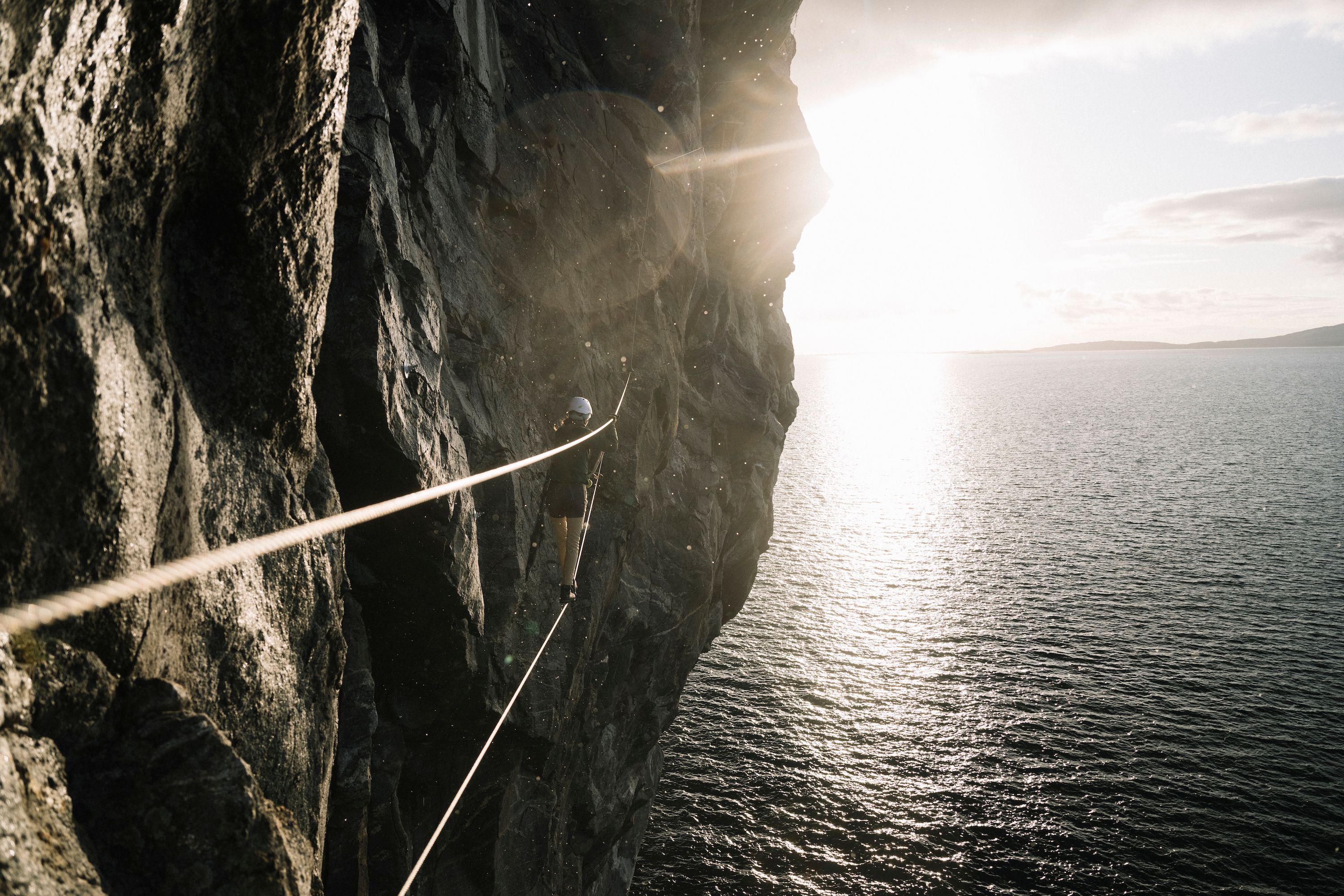
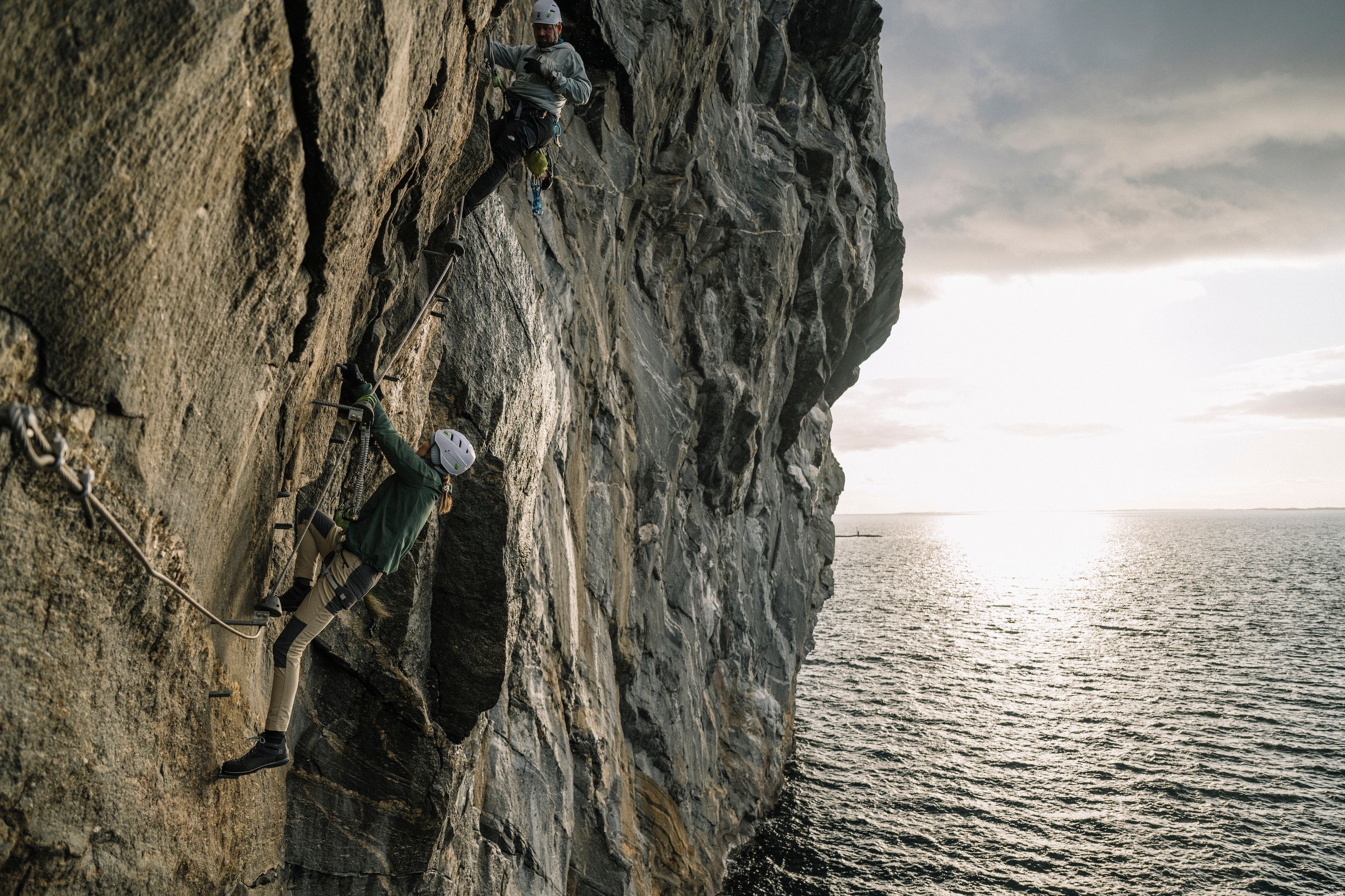
Let nature speak
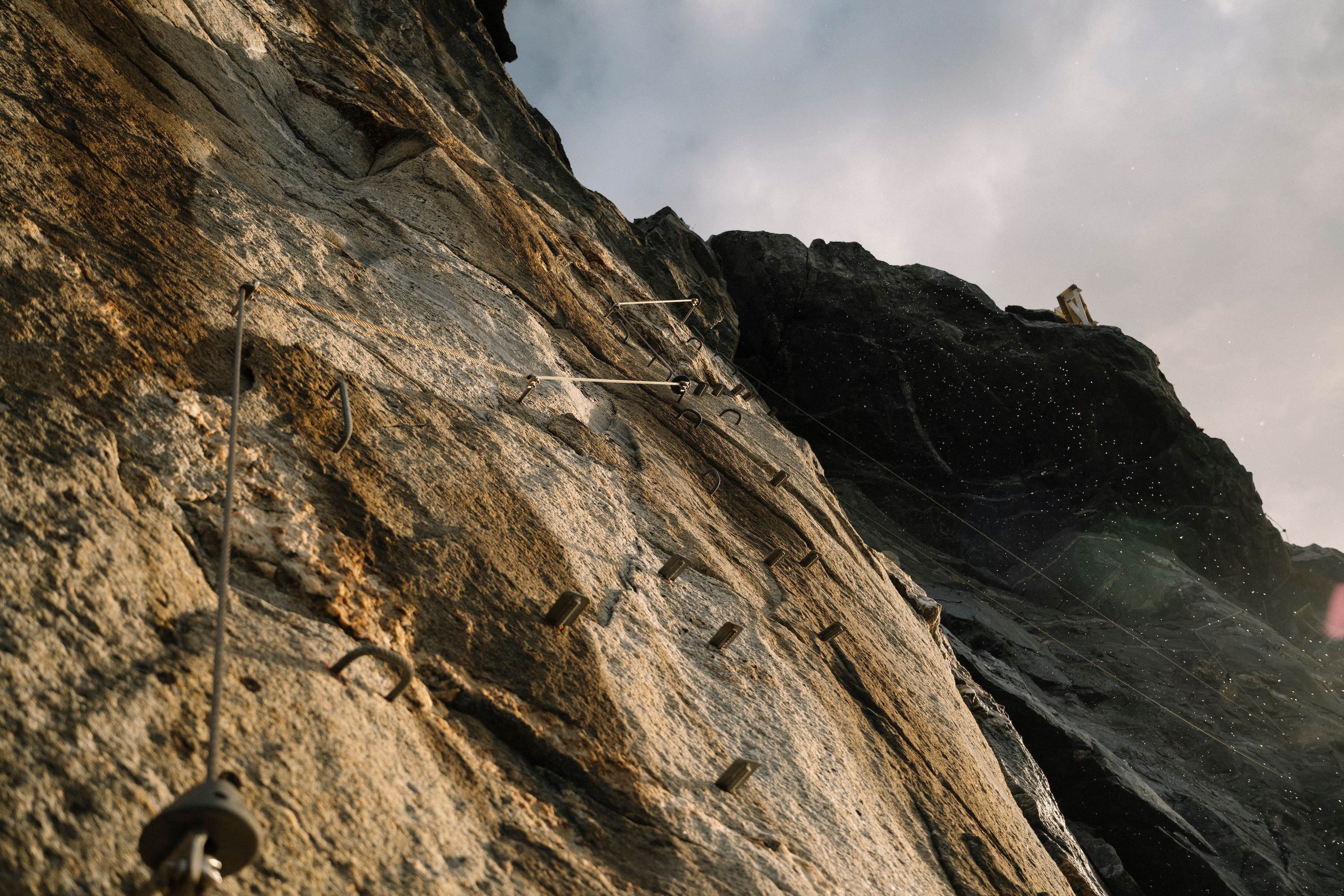
Eagles soaring, waves crashing against rocks, the odd whale surfacing. The via ferrata at Rampen goes directly above the sea and offers a unique experience that’s close to nature. We focused on great imagery and film and toned down excess brand elements.
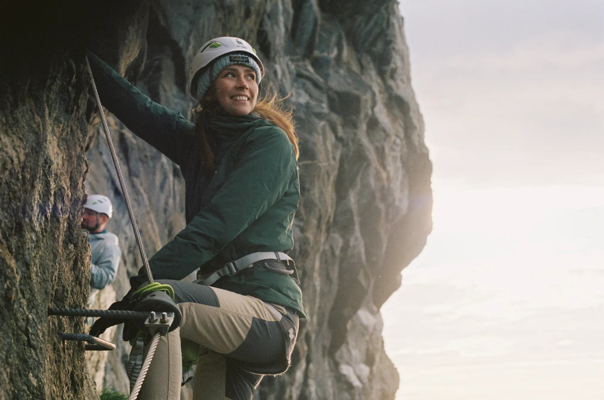
Quality and tranquility
Brands and experiences in the outdoors market are often dominated by colours, symbols and overdoses of adrenaline. To stand out we positioned Rampen as a more high-end experience with few colours, custom fonts and tight art direction on images and film. Rampen shows you don’t have to shout loud to get attention.


The logomark is composed of shapes from a carabiner to create associations to climbing, cliffs and the outdoor.
A rounder logo stands out in the outdoors and sports market. The main logo is horizontal and used on web and signage.
The vertical logo is used on bigger surfaces as it needs more air around it. Mainly used on imagery and merch.
Flexible and customizable
Rampen is built on Sanity and integrated with a bespoke booking system for tourism in Northern Norway; Bilberry. This allows for easy tailoring of new experiences and product offerings.


Want to hear more about Rampen?
Get in touch with Lotte Camilla